Flip Flop postmortem
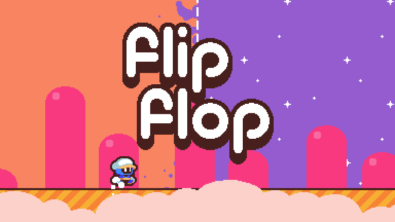
For the longest time, my history of participating in gamejams has been a list of "close but no cigar". I either burned myself out way before the deadline, had no time to finish my grandiose ideas, or didn't polish the game enough for it to truly shine.
While I did get an occasional shoutout here and there thanks to my art, my gameplay wasn't something that people complimented. At best, it was decent. Good ideas, subpar execution.
When I joined Gamedev.js Jam 2021, I promised myself I'd do things differently. With two weeks allocated for development, I was determined not to let my poor time management get in the way.
Now, merely a week since the release of Flip Flop, this game has attracted more views than all of my previous games combined.
If you're curious to see Flip Flop in action, you can play it in your browser. But if you have played it already and wonder how it came to be, read on.
Designing Flip Flop
The theme for the Gamedev.js Jam 2021 was Mirror. I felt it was a really strong theme that suited me: it wasn't too restrictive but still imposed a clear vision I needed to follow.
First things first, I needed an idea. Instead of throwing myself at the first concept that popped into my head, I decided to explore different words that could be connected to mirrors.
Making a light-based puzzle would be the path of least resistance for me, as I had an unfinished game concept that utilized mirror shields ala The Legend of Zelda. Then again, I figured there would be a lot of games with this mechanic, and I wanted my game to stand out.
Several hours later, I arrived at the idea of mirroring levels themselves. I envisioned a scientist who would be able to reflect the left half of the screen onto the right half. If there was a gap he couldn't jump over or a wall he couldn't climb, he'd only need to mirror-flip the level.
And thus, Flip Flop was born. (Although I called it Shattered at first, because the scientist was supposed to collect broken shards of a mirror.)
This is how it looked like in the very beginning:
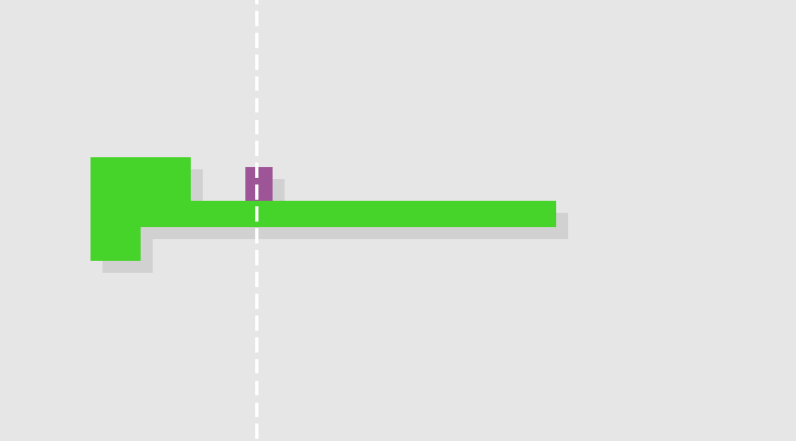
Surprisingly, the core mechanic was easy to implement. Basically, it works like this: for every platform, I compare its X coordinate against the X coordinate of the cutoff line.
If the platform is to the left of the line and doesn't touch it, I calculate the distance between them and create an identical platform to the right.
If the platform is to the left of the line and touches it, I simply extend the platform's width until it's symmetrical.
Everything to right of the line simply disappears.
At that time already, I knew Flip Flop would be all about short levels. The goal would be to snatch a shard and return from the mirror dimension with it. (This is akin to collecting strawberries in Celeste: they start following you upon pickup but you only truly collect them once you land on a safe territory.)
Now, this was just the beginning, but it already looked promising. With the central mechanic established, I began to work on my art like a maniac. About four days in, the game went from green and purple squares to this:
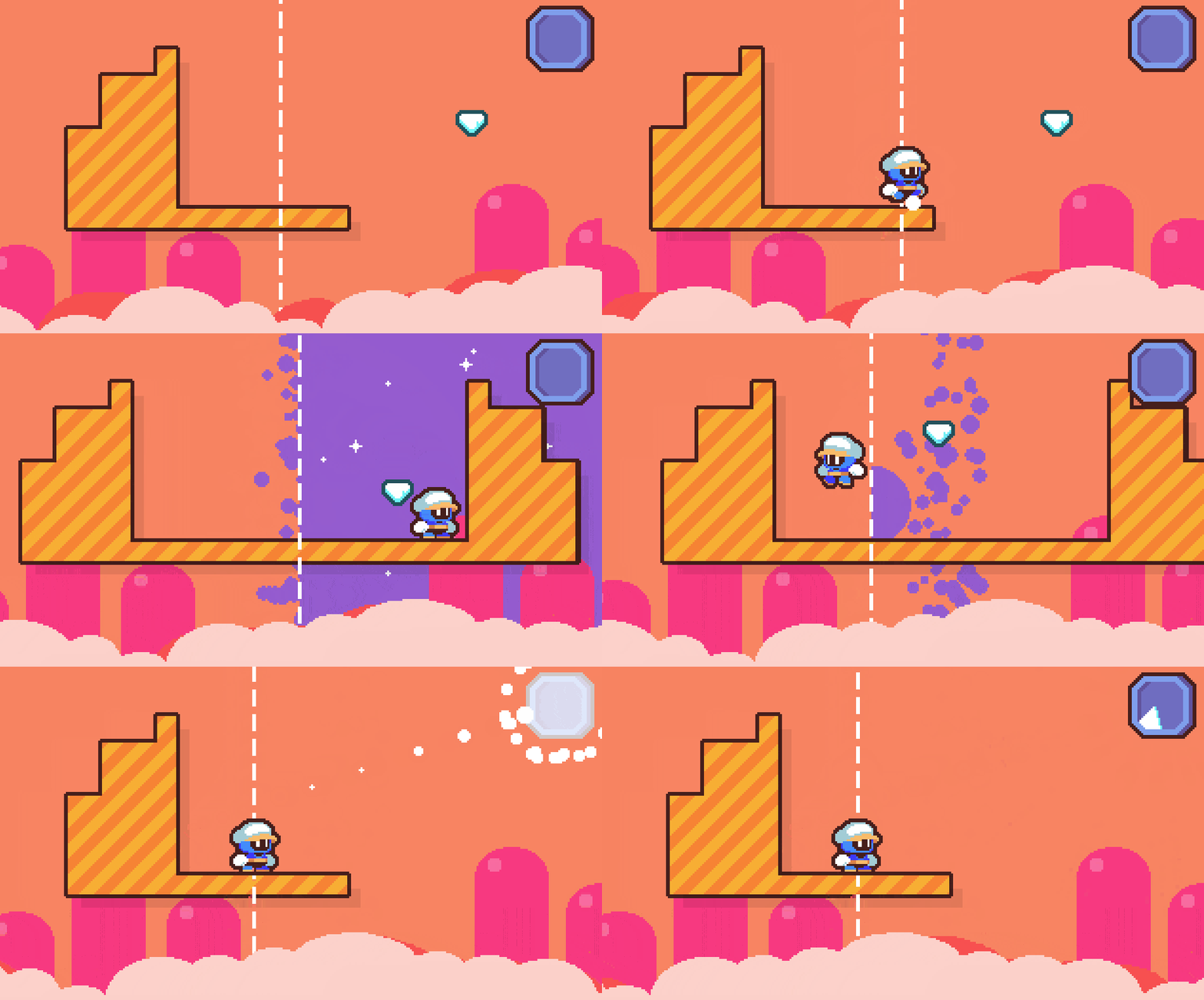
I spent a lot of time tweaking the feel and look of mirror-flipping until I was satisfied. I actually found myself hopping and bopping across the stage, mindlessly flipping the level for the fun of it.
The following week was spent on making an intro cutscene, a dialogue system and, of course, levels.
For once, I was extremely proud of what I made. For the first time, the game that was in my head paled in comparison to the real game.
But enough patting myself on the back, let's get down to what went right and what went wrong.
What went right
#1: The art
I said "enough patting myself on the back", but here I go singing praises to myself again.
What can I do? I simply dig the style of Flip Flop. It's bright, colorful and cute.
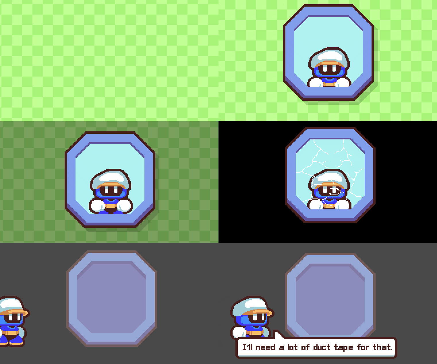
One of the first effects I actually made for the game was the stripes travelling along the surface of platforms. It helps make the game feel alive and bouncy even when there's nothing happening on the screen.
Another effect I'm proud of is the mirror dimension itself. It looks visually different from the rest of the level.
I also got inspired by this gif from Blabberf to add bubbles to it. It added the feel of the dimension somehow seeping into our world.
Whenever the player would deactivate the mirror dimension, these bubbles would be the last to go, which I felt added to the experience.
The only thing I wasn't too happy art-wise was the sameness of levels. Flip Flop only has one look: orange skies and yellow platforms. I wanted to draw more diverse world settings, but in the end decided to focus on my level design.
Speaking of which...
#2: Level design
I think that overall, level design could be a bit tighter, but there is a nice difficulty progression.
When designing puzzles, it's always hard to estimate how difficult they are. After all, you know exactly how to solve them! So I gave my game to other people for playtesting: my friends, my girlfriend, and even my dad.
They've all managed to beat the game without frustration, which was good. I aimed for a more casual gaming experience, after all.
It was fun for me, too. I had to come up with ways to introduce mechanics and gradually build them up. The first few levels were extremely easy and had obvious solutions, but their main purpose was to show what mirror-flipping a level could do.
The same goes for when I introduced a new type of block — mirrorite, which cannot be mirrored and stays in its spot. Now the players were forced to find the solution with this new mechanic in mind. The first level with it was easy and even had an introductory monologue from Dr. Flips, but later it got progressively harder.
Well, maybe "harder" isn't the right word as the levels still were quite easy to beat. Still, there was enough diversity in level design to mask this lack of difficulty.
#3: Music
I'm what some people might call a jack of all trades, but music has always been my blind spot. I've composed a few tracks in my life, and some of them I even liked well enough, but they weren't exactly The Greatest Hits material.
I asked my good friend Meat Automaton to help me with the soundtrack. He's an amateur musician who's picked up composing a few months ago, so I thought it'd be a good challenge for both of us to create something cool in just two weeks.
We've collaborated before on my as-of-yet unreleased project, but Flip Flop became the first released game that incorporated his tunes.
Once every other day, my friend would show me a new melody and I had to decide whether it fit the atmosphere. By his own admission, he struggled at first, as he was accustomed to more downbeat, melancholic music. Since I don't have a background in music theory, the best I could offer is, "Hey, why don't we get inspired by Kirby?"
The final track is actually a combination of two separate tracks that my friend has sent me. I didn't want to pick one over the other, so we merged them together. Another, earlier tune became the title screen theme.
Flip Flop also implemented an interesting sound effect: I applied a low-pass filter to the background music whenever the player was inside the mirror dimension. This filter reduces the frequencies above the selected threshold, making the music sound lower and darker.
My friend, again, helped me out by suggesting the way I should tweak the parameters so that it would sound just right.
What went wrong
#1: Scrapped mechanics
When Vykri, another participant of Gamedev.js Jam, finished Flip Flop on stream, he was hoping for a New Game+ that would add something extra to the experience.
But there was no New Game+. Not because I didn't want to make one but because I had to scrap it.
Since almost day one, my vision was that there would be a turning point in the game. Once you've collected all of the shards, you'd be presented with a new core mechanic: Dr. Flips from the mirror dimension! (I called him Dr. Flops.)
The way this would work is that Dr. Flops would stay at the bottom of the level and mirror all of your movements. At first, levels would be vertically symmetrical so both characters would move in unison.
In later levels, I would introduce differently shaped stages that would block one character's movement but let the other continue walking and jumping.
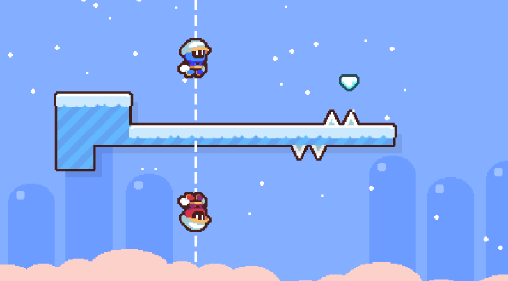
I felt this was shaping up to be a worthy addition, but alas, I was running out of time. Plus, it's not exactly a unique mechanic in and of itself. There are plenty of games out there where you control two characters simultaneously.
Still, if I ever do a full version of Flip Flop, you'd definitely see more of Dr. Flops.
#2: Default control scheme
One of the oft-repeated minor complaints was that Flip Flop was difficult to control for people who use non-QWERTY keyboards.
I went with the standard control scheme of arrow keys for movement, Z for jumping, and X for action. However, I did not account for different keyboard layouts, even though allowing custom controls wouldn't take a lot of my time.
This was a big learning point for me. I tried to make my game accessible to everyone, with its bright visual style and easy difficulty level, but something as simple as control completely escaped me.
In the future, custom control mapping will be my top priority from the word go.
What's next for Flip Flop
Flip Flop was a blast to design and develop. I've learned tons making this game and, truth be told, I grew very fond of it.
It was supposed to be a one-and-done sort of thing, but now I'm wondering whether I should make it a full-blown game, with dozens of levels. I'm not ready to let Dr. Flips go, I feel like he's got a lot of adventures ahead of him.
Thanks for reading this postmortem! If you've played Flip Flop and have suggestions how to make it even better, let me know in the comments below.
You can also follow me on twitter where I'm posting regular updates, pictures and gifs.
See ya!
Flip Flop
It's a mirror-flipping masterpiece
| Status | Released |
| Author | FeatureKreep |
| Genre | Platformer |
| Tags | 2D, Casual, Puzzle-Platformer |
More posts
- Flip Flop won Gamedevjs.Jam 2021 🏆May 04, 2021
Leave a comment
Log in with itch.io to leave a comment.